
Custom Code
Inject custom HTML and CSS into the client panel header and footer, control sidebar branding, and preview changes from the admin Settings page.
What the Custom Code page does
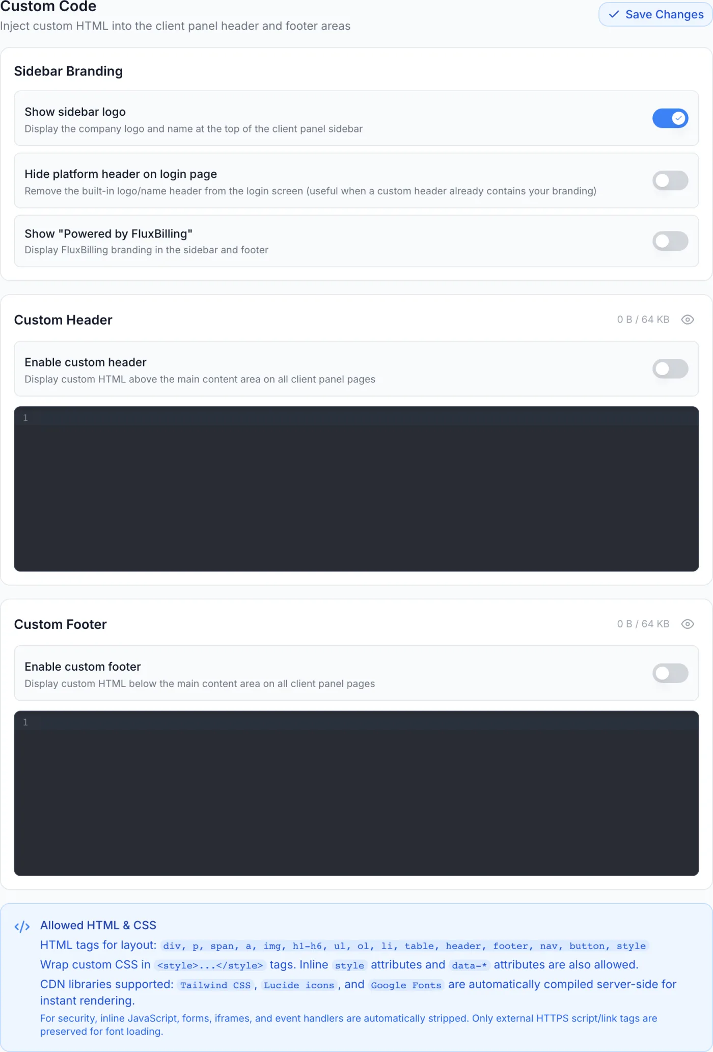
The Custom Code page lets you inject your own HTML and CSS into the client panel without touching anything technical. It gives you two injection slots — a Custom Header that renders above the main content and a Custom Footer that renders below it — plus a small set of Sidebar Branding switches that control the built-in logo, the sign-in page header, and the “Powered by” badge.
How to reach it
Open the admin panel and go to Settings. In the settings menu, find the Appearance group and click Custom Code. It sits alongside Themes and Icons.
Sidebar Branding toggles
The first card, Sidebar Branding, holds three switches.
| Switch | What it does |
|---|---|
| Show sidebar logo | Displays the company logo and name at the top of the client panel sidebar. Turn it off if your custom header already carries the branding and you want a cleaner sidebar. On by default. |
| Hide platform header on login page | Removes the built-in logo and name header from the sign-in screen — useful when a custom header already contains your branding, so two logos are not shown. Off by default. |
| Show “Powered by FluxBilling” | Controls whether the “Powered by” badge appears in the client sidebar and footer. This switch is only editable when white-label is part of your licence; otherwise it is greyed out beside a White Label badge and the note “Purchase the white-label add-on to control this setting”. On by default. |
Editing the header and footer
Below the branding card are two near-identical cards, Custom Header and Custom Footer. Each has an enable toggle, a dark code editor, a size indicator and a preview button. The workflow is the same for either slot:
- Switch on Enable custom header (or Enable custom footer). While it is off, your code is kept but not shown to customers, so you can prepare markup before going live.
- Type or paste your HTML into the code editor. It shows line numbers and wraps long lines.
- Watch the size indicator at the top-right of the card — it shows the current content size against the 64 KB budget for that slot (for example
1.2 KB / 64 KB). Keep large assets external rather than inlining them. - Click the eye icon at the top-right of the card to Show preview. An isolated render of your current markup appears directly beneath the editor. Click it again to hide the preview; with an empty editor it reads No content to preview.
- When you are happy, click Save Changes at the top-right of the page. Nothing you typed reaches the live panel until you save; a confirmation then reports that the custom code was saved and compiled.
Where the header and footer appear
Both slots apply to the customer-facing panel only — they never appear in the admin panel. Within the client panel they show up in three places:
- On the signed-in pages, above and below the main content area.
- On the sign-in and other account-access screens.
- On the customer-facing documentation pages.
Because they appear consistently across the whole customer experience, the slots suit a persistent announcement bar, a secondary navigation strip, compliance links, or a branded footer.
Control reference
| Control | Where | What it does |
|---|---|---|
| Show sidebar logo | Sidebar Branding | Shows or hides the company logo and name at the top of the client sidebar. |
| Hide platform header on login page | Sidebar Branding | Removes the built-in logo and name header from the sign-in screen. |
| Show “Powered by FluxBilling” | Sidebar Branding | Shows or hides the “Powered by” badge. Editable only with white-label on your licence. |
| Enable custom header | Custom Header card | Turns header injection on or off without clearing your saved code. |
| Enable custom footer | Custom Footer card | Turns footer injection on or off without clearing your saved code. |
| Code editor | Both cards | Where you write the markup and styling for that slot, with line numbers and word wrap. |
| Size indicator | Both cards | Shows current content size against the 64 KB budget for that slot. |
| Preview (eye icon) | Both cards | Toggles an inline, isolated render of the current slot content. |
| Save Changes | Page header | Commits both slots and the branding toggles together. Required for anything to apply. |
What HTML and CSS is allowed
The help panel at the bottom of the page lists what you can use. Stick to layout-oriented tags — these are accepted:
div, p, span, a, img, h1-h6, ul, ol, li, table, header, footer, nav, button, style
To add styling, wrap your CSS in <style>...</style> inside the same slot. Inline style attributes and data-* attributes are also allowed on elements. Three hosted libraries are supported and compiled for you so they render instantly: Tailwind CSS, Lucide icons and Google Fonts.
Warning: For safety, inline JavaScript, form tags, embedded frames and event handlers are removed from your code when it is saved — only external secure script and link tags are kept, for font loading. The header and footer therefore cannot be used to run scripts or embed a third-party form.
Tips and gotchas
- Save before you leave. Typing in an editor or flipping a toggle changes nothing on the live panel until you click Save Changes.
- Keep assets external. The 64 KB budget per slot is generous for a banner, strip or footer, but it is not the place for large inline images. Host those yourself and reference them by address.
- Use the preview while editing. It renders in an isolated frame, so it is the quickest way to confirm spacing and styling before customers see it.
- Disable instead of delete. If a header or footer causes a layout problem, turn off its enable toggle and save — your markup is preserved for when you want it back.
- Check the sign-in screen too. Because the slots also render there, review the sign-in page after any change, especially if you have hidden the built-in header.