
Customize Order Page
Edit your customer Order New Service page: subtitle, Quick Stats cards, category grid columns, and Why Choose Us feature blocks in a live preview.
What the Order Page editor is for
Customize Order Page is the storefront editor for your customer-facing Order New Service page. It lets you edit the page subtitle, the row of Quick Stats cards, the Category Grid Layout, and the Why Choose Us? feature blocks — all in a live preview that mirrors what your customers see when they go to order. Its own subtitle says as much: “Edit the page exactly as your customers will see it.”
How to open it
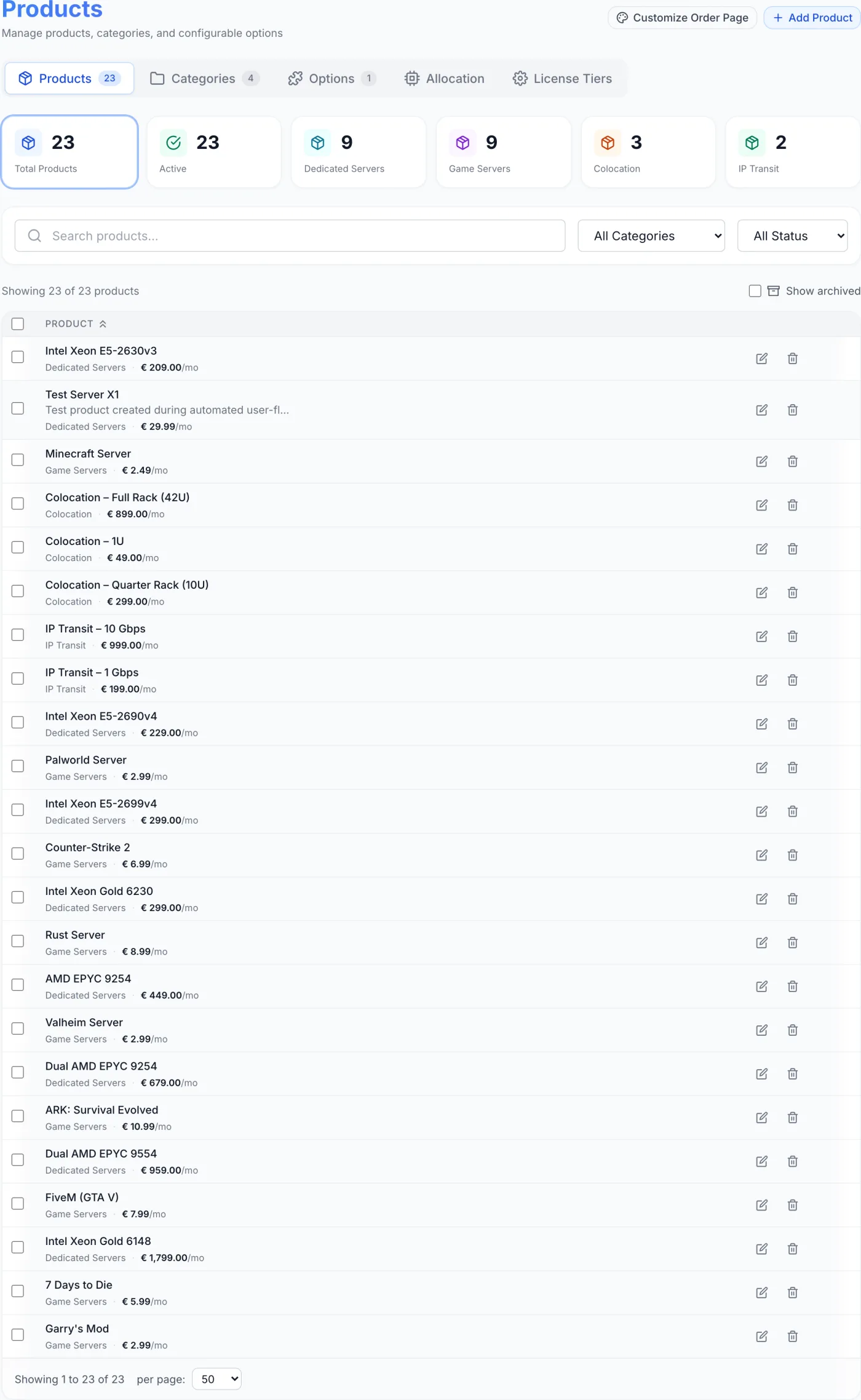
- Open the Products page from the sidebar.
- In the page header (top-right, beside the title), click the Customize Order Page button (palette icon).
- The editor opens as a centred overlay over the page. The button appears while you are on the Products, Categories, or Options tab; it is hidden on the Allocation tab.
Warning: Nothing you change goes live until you click Save Changes. Closing the editor with Cancel or the X in the top corner discards every edit made since you opened it.
The four sections you can edit
The editor body is laid out top-to-bottom as a preview of the real order page. Each section is described below.
1. Page header
The large title Order New Service is fixed and cannot be changed here. Directly beneath it is an editable subtitle field (default text: “Choose the plan that fits your needs”). Click into the dashed-underline field and type your own tagline — for example a delivery promise or a short value statement. Leaving it blank shows the placeholder “Page subtitle…”.
2. Quick Stats
A row of small stat cards shown near the top of the order page — ideal for headline figures like uptime, support hours, or setup speed. The default set is three cards: 99.9% Uptime, 24/7 Support and Instant Setup. You can have between 1 and 6 cards.
- Edit a card — click the large Value text (for example “99.9%”) or the smaller Label beneath it and type directly. Both are required before you can save while the section is shown.
- Change the icon — click the coloured icon tile at the top of the card to open the icon picker, then pick from the grid of icons.
- Change the colour — click one of the coloured dots at the bottom of the card.
- Add a card — click Add at the top-right of the section. The button disappears once you reach 6 cards.
- Remove a card — hover over a card and click the small red trash button that appears in its top corner. You cannot remove the last remaining card.
- Hide the whole row — click the eye button at the top-right of the section. The section dims and is marked Hidden; customers do not see the stat row at all, and its fields are no longer checked when you save. Click the eye again to bring it back.
3. Category Grid Layout
This controls how your product category cards are arranged on the order page below the stats. Use the toggle in the top-right of the section to choose 1 Column, 2 Columns, or 3 Columns; the preview updates immediately. The default is 2 columns. The setting is a maximum for wide screens — the live page narrows to fewer columns on small screens, and never shows more columns than you have categories. A note at the bottom reads “Categories are managed in the Products tab” — this editor only sets the layout, not the categories themselves.
Tip: To add, rename, recolour, or reorder the actual categories, use the Product Categories tools on the Products page. Each category also has its own Order Page Display settings (a Color Scheme, an Icon and Feature Tags) in its category editor.
4. Why Choose Us?
A highlighted block of feature cards shown further down the order page. The block heading is itself editable (default: Why Choose Us?) — click it to rename it. Below the heading you can have between 1 and 6 feature items; the defaults are High Performance, 24/7 Support and Secure & Reliable.
- Edit an item — click the Title line and the Description line to type your text. Both are required while the section is shown.
- Change the icon — click the coloured icon tile on the left of the item to open the icon picker.
- Change the colour — click one of the coloured dots at the bottom of the item.
- Add an item — click Add Item at the top-right of the section (hidden once you reach 6 items).
- Remove an item — hover and click the red trash button in the item's corner. At least one item must remain.
- Hide the whole block — click the eye button beside Add Item, exactly as on Quick Stats.
Icons and colours
The icon picker is the same everywhere in this editor: a scrolling grid of 47 icons covering infrastructure, network, security, support, commerce and general shapes. Ten accent colours are available on every card and item — blue, green, purple, orange, red, cyan, amber, pink, teal and indigo. The colour tints the icon and its tile, not the whole card.
Field reference
| Element | Where | What it does |
|---|---|---|
| Subtitle | Header | Tagline shown under the fixed “Order New Service” title. |
| Show / hide | Quick Stats and Why Choose Us? | Eye button that takes the whole section off the customer's order page. |
| Value | Quick Stats card | The large headline figure or word (for example “99.9%”, “Instant”). Required. |
| Label | Quick Stats card | The smaller caption under the value (for example “Uptime”). Required. |
| Stat icon | Quick Stats card | Visual icon, chosen from the icon picker. |
| Stat colour | Quick Stats card | Accent colour for the icon, from ten choices. |
| Category columns | Category Grid Layout | Arranges category cards in up to 1, 2, or 3 columns. |
| Section title | Why Choose Us? | Editable heading for the feature block. |
| Item title | Why Choose Us? item | Short feature name (for example “High Performance”). Required. |
| Item description | Why Choose Us? item | One-line supporting text. Required. |
| Item icon & colour | Why Choose Us? item | Icon and accent colour for the feature card. |
Saving and resetting
- When the preview looks right, click Save Changes at the bottom-right. The button reads Saving… while it publishes.
- A confirmation appears (“Order page updated”) and the editor closes. Your changes are now live on the customer order page.
- Reset to defaults, at the bottom-left, puts every section back to the shipped defaults inside the editor. Nothing is written until you then click Save Changes, so you can still back out with Cancel.
- To discard everything instead, click Cancel.
Note: Save is blocked if a visible Quick Stat is missing a value or label, if a visible Why Choose Us item is missing a title or description, or if the Why Choose Us block is shown with no items at all. A message names which of the three to fix. Sections you have hidden with the eye button are not checked.
Tips and gotchas
- Match claims to reality. The defaults include phrases like “Instant” setup and “99.9%” uptime — only keep these if you can actually deliver them. Replace anything you cannot back up.
- Pick the right column count for your catalogue. Three columns suit a long list of categories; one or two columns read more cleanly with only a few categories.
- Keep stats and features tight. Six is the maximum for each, but a focused set of three or four usually looks stronger than a crowded row.
- Hide rather than empty. If you do not want a stat row or a feature block at all, use the eye button. Trying to leave the fields blank only blocks the save.
- Colours are accents only. A stat or feature's colour tints its icon, not the whole card — use it to group related items or match your brand palette.
- This page is not your only storefront. If you sell domain names, you can put a search box on your own website that drops visitors straight into this order flow with the name filled in — see Domain Search Widget.
Related
Products · Product Categories · Domain Search Widget · Placing an Order