
Dashboard
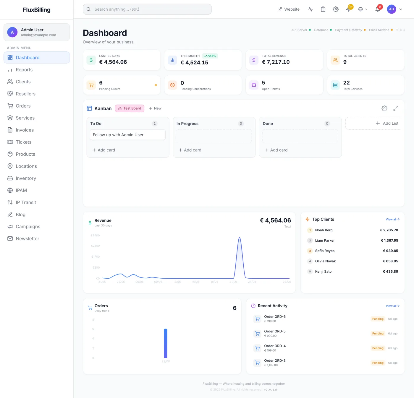
Tour of the FluxBilling admin Dashboard: revenue tiles, health indicators, quick counters, the Kanban board, charts, top clients, and activity.
What the Dashboard is for
The Dashboard is the operational home screen of the admin panel. It opens automatically right after you sign in and gives staff an at-a-glance read on money collected, sales activity, support load and client count — without having to drill into individual pages. Think of it as the morning overview you check before getting into the day's work.
How to reach it
The Dashboard is the first item in the left sidebar (the Dashboard link), directly above Reports. It is also the default landing page after you sign in, so you will usually arrive here without clicking anything. Every staff member can open it — it needs no special permission.
The status strip and version
Beside the page title, on the right of the heading row, FluxBilling shows a row of small health indicators. Each one is a tiny coloured dot next to a label: green means online, amber means degraded, and red means offline. Four checks are reported:
| Indicator | What it tells you |
|---|---|
| API Server | The application is reachable and responding. If the page loaded at all, this is green. |
| Database | The data store answered a test query. Red means it did not. |
| Payment Gateway | Green when at least one payment gateway is enabled and ready. Amber when gateway integrations are installed but none is enabled or fully configured. Red when no gateway is configured at all — customers cannot pay. |
| Email Service | Green when the configured mail provider accepted a connection test. Amber when the provider is configured but the test did not succeed. |
To the right of the dots is the platform version this installation is running (for example v1.2.3). If your installation runs under a subscription licence, a short summary follows it:
- Due in — whole days until the licence's next renewal date. The figure turns amber inside 30 days and red inside 7, and reads Expired once the date has passed. It is hidden when no renewal date is known.
- Clients — your active client count, shown against your licence's client limit when one applies. The number turns red once you reach the limit.
- Servers — the same, for your server count against your licence's server limit.
Tip: check the Payment Gateway indicator before launching a promotion or sending out renewal invoices — a red dot there means new orders can stall at the payment step.
Note: the indicators are checked when the Dashboard loads, not continuously. Reload the page to re-run the checks.
The stat tiles
Across the top sit four money tiles. All figures are converted into your base currency — each payment is converted using the exchange rate recorded with it at the time it was taken.
| Tile | What it shows |
|---|---|
| Last 30 Days | Payments completed in the trailing 30 days. |
| This Month | Payments completed since the start of the current calendar month. A small badge shows the percentage change against the same point last month — green with an up arrow when growing, red with a down arrow when falling. A brand-new store with no prior month to compare against shows a New badge instead, and a swing beyond 999% is shown as 999%+ rather than an absurd figure. |
| Total Revenue | All payments ever completed. |
| Today's Income | Payments completed since the start of today. |
Note: all four tiles count money actually collected, so unpaid or pending invoices never inflate them, and a payment that is later marked refunded stops counting. Amounts settled from a client's credit balance are left out of these tiles, because the money was already counted when the client topped that balance up.
The quick-counter row
Below the stat tiles is a row of four counters. Three of them are shortcuts to the matching list page.
- Pending Orders — orders awaiting action. A pulsing amber dot appears when the count is above zero. Click the tile to open the Orders list.
- Pending Cancellations — services with a cancellation already scheduled. A pulsing orange dot appears when there are any. Clicking it opens a review window (described below) rather than navigating away.
- Open Tickets — currently open support tickets. Click to open the Tickets list already filtered to open tickets.
- Total Clients — the number of client accounts. A small +N badge appears beside it when one or more clients signed up this month. Click to open the Clients list.
Reviewing pending cancellations
Clicking the Pending Cancellations counter opens a Pending Cancellations window listing each service that has a cancellation scheduled. For every entry you see the service name and its product, the client, the date the service will cancel (Cancels <date>), when the request was made (Requested <date>), an optional Reason: line, and who asked for it. The service name links to that service's detail page.
- Click the Pending Cancellations counter to open the window.
- Review the scheduled date and reason for each service.
- To stop a cancellation, click Revoke on that row. The scheduled cancellation is cleared and the service stays active; a confirmation appears and the row leaves the list.
- Close the window when you are finished. The counter reflects any revocations.
When nothing is scheduled the window reads No pending cancellations.
The Kanban task board
Beneath the counters is a built-in Kanban board for organising staff work — onboarding checklists, follow-ups, internal to-dos. It behaves like a lightweight project board.
- Create a board — with no boards yet you get an empty state reading No boards yet and a Create Board button. Once you have one, the New button in the board tab strip adds another. The create window asks for a board name and a background colour.
- Switch boards — the tab strip beside the Kanban heading lists your boards; click one to load it.
- Board settings — the gear icon in the board header opens Edit Board, where you rename the board, change its background colour, set Visibility to All Admins (shared) or Private (only you), or delete the board after a confirmation.
- Lists and cards — use Add List to create a column and Add card inside any list. Click a list title to rename it; the bin icon on a list deletes the list and every card in it. Drag cards to reorder them inside a list or move them between lists.
- Card details — click a card (a click, not a drag) to open it. From there you can write a description, attach labels, assign members, set a due date, build checklists, leave comments, and delete the card.
- Expand — the expand icon in the board header gives the board far more vertical room when you have a lot of cards; click it again to collapse.
Note: the Kanban section disappears entirely when the Kanban module is switched off in the feature toggles. If you do not see it, check the toggles described in Modules & Feature Toggles.
Revenue and Top Clients
The next row pairs a revenue chart with a top-clients panel.
- Revenue (subtitled Last 30 days) — an area chart of money collected per day over the last 30 days, with the period total shown to the upper right. Hover any point to read that day's figure. Until there is anything to plot it shows No revenue data yet.
- Top Clients — your five highest-spending accounts, numbered 1 to 5 with the top three tinted gold, silver and bronze. Each row shows the client's name and total spend and links to that client's profile. View all opens the full Clients list. With no clients yet you get No clients yet and an Add your first client shortcut.
Orders trend and Recent Activity
The final row shows order volume next to a short activity feed.
- Orders (subtitled Daily trend) — a bar chart of how many orders arrived each day over the last 30 days, with the period total beside the heading. It reads No orders yet until orders exist.
- Recent Activity — the four most recent events across new orders, support tickets and client sign-ups, each with an icon, a title, a subtitle (the order total, the ticket's department, or the new client's email address), a status badge where the record has one, and a relative timestamp such as 5m ago or 2h ago. Click an entry to jump to the related record. View all opens the Orders list. With nothing to show it reads No recent activity.
How often the figures refresh
The Dashboard is not a live wallboard. Its tiles, counters, charts, top-clients list, activity feed and health dots are all fetched when you open the page and then held in a short-lived cache, so returning to the Dashboard from another page usually redraws the cached figures rather than re-querying. Reload the page when you need certainty that a number is current.
How long that cache lasts — and whether it is used at all — is controlled by the caching options described in Performance Settings. If you need figures over a period other than 30 days, month-to-date or all time, use the Reports page in the sidebar instead: it carries its own date-range selector and a much deeper set of business metrics.
The update banner
When a newer platform version is published, a coloured banner appears above the Dashboard heading reading Update Available with the new version number and your current one. It offers a button that copies the upgrade command to your clipboard, a Release Notes link, and a How to upgrade section you can expand for the ordered steps. The × in its corner dismisses it; that version's banner stays hidden in that browser afterwards, and a later version brings it back.
The page footer
At the very bottom of the Dashboard sits a small footer line with the product name, the copyright year and the version this panel was built as. It is informational only.
Tips and notes
- The This Month comparison badge measures the current month so far against the same elapsed portion of last month, so growth early in the month is not misleadingly shown as a drop.
- A pulsing dot on Pending Orders or Pending Cancellations is the fastest signal that something is waiting on a human — neither clears itself.
- Boards set to Private are visible to you alone; use All Admins for anything a colleague may need to pick up.
Related articles
Reports · Clients · Orders · Invoices · Services · Tickets · Settings · Modules & Feature Toggles · Top Header & Global Search