
Icons
Pick one icon library to style every glyph across your admin and client panels. Preview the six options, then Save to apply the change interface-wide.
What the Icons page does
The Icons page lets you choose the single icon set used to draw every glyph across your admin and client panels. Sidebar icons, dashboard cards, buttons, status badges and menu markers all switch together to match the style you pick, so the interface stays visually consistent.
How to reach it
Open Settings in the admin panel, then look in the Appearance group of the settings menu and select Icons. The card heading reads Icon Library, and the same group also contains Themes and Custom Code.
Choosing an icon library
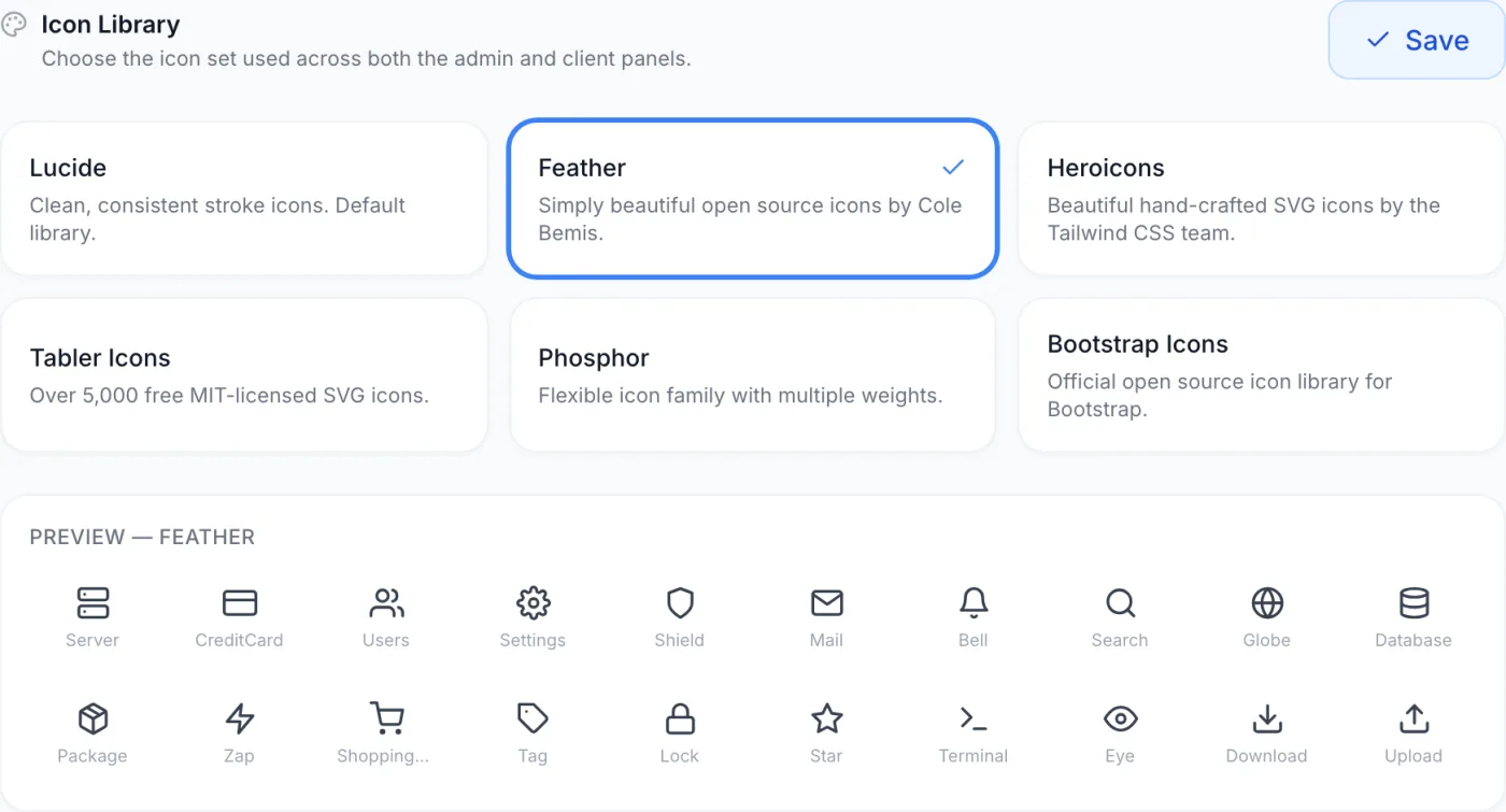
The page shows the available sets as a grid of cards, each with a name and a one-line description.
- Click a card. The selected card is outlined in blue with a check mark, and the preview grid below redraws using icons from that set.
- Compare the preview. The preview always shows the same sample icons, so you can move between cards and judge each set without committing to anything.
- Click Save. The Save button sits in the top-right of the page beside the heading. Until you click it, nothing changes for anyone — selecting a card only updates the preview on your screen.
Note: Selecting a card does not apply the change. The choice is only stored when you click Save, which confirms with a short Icon library updated message. If you navigate away first, your previous set stays in effect.
Available sets
Six sets are offered. They differ in stroke weight, corner shape and overall character; they all cover the same concepts, so any choice works for every feature.
| Set | Description shown on its card |
|---|---|
| Lucide | Clean, consistent stroke icons. This is the default set. |
| Feather | Simple, light open-source icons. |
| Heroicons | Hand-crafted icons with a slightly softer shape. |
| Tabler Icons | A very large free set, over 5,000 icons. |
| Phosphor | A flexible icon family with multiple weights. |
| Bootstrap Icons | A widely used open-source icon set. |
The preview grid
Below the cards, a preview grid renders a fixed set of representative icons in whichever set is currently highlighted. Its heading names the set being previewed, and each icon is labelled underneath so you can see exactly how common interface glyphs look. The previewed icons are:
Server, CreditCard, Users, Settings, Shield, Mail, Bell, Search, Globe, Database, Package, Zap, ShoppingCart, Tag, Lock, Star, Terminal, Eye, Download and Upload.
Because the preview shows the same twenty icons for every set, it is the quickest way to compare styles. Hover over an icon to see its name in a tooltip, and use the row to judge stroke weight, fill and roundness before you commit.
How the change takes effect
When you click Save, the new set is stored as the interface-wide icon choice and applies to both the admin and the client panel. Your own admin session picks it up as soon as the save completes; other staff and your customers see it the next time their panel loads. There is nothing to clear or restart.
Note: If a set does not include one of the icons the interface needs, that icon is drawn from the default set instead, so no button or menu is ever left without one. In the preview grid, a sample icon a set does not provide simply leaves its slot blank.
Tips and notes
- Pick a style that matches your brand. If your theme uses bold colours and rounded shapes, a softer set complements it; a crisp, technical look pairs better with a thin, even stroke.
- Functionality never changes. Switching sets only changes how icons look — every button, menu and page keeps working the same way.
- Use the preview before saving. Cycle through all six cards and watch the grid; that is faster and safer than saving and judging the result live.
- One set at a time. The whole interface uses a single set, so you cannot mix icons from different ones.
- The setting is shared. Your icon choice is not a per-person preference — it changes the look for everyone who uses your panels, so confirm the style works for both staff and customers.
Related
See Themes to change colours and branding, Custom Code to add your own markup and styling, and General settings for the logo and company name.