
Plugin Forms and Service Panels
Build the screens a plugin adds: client and admin service pages from panels, and product settings and order fields from form fields.
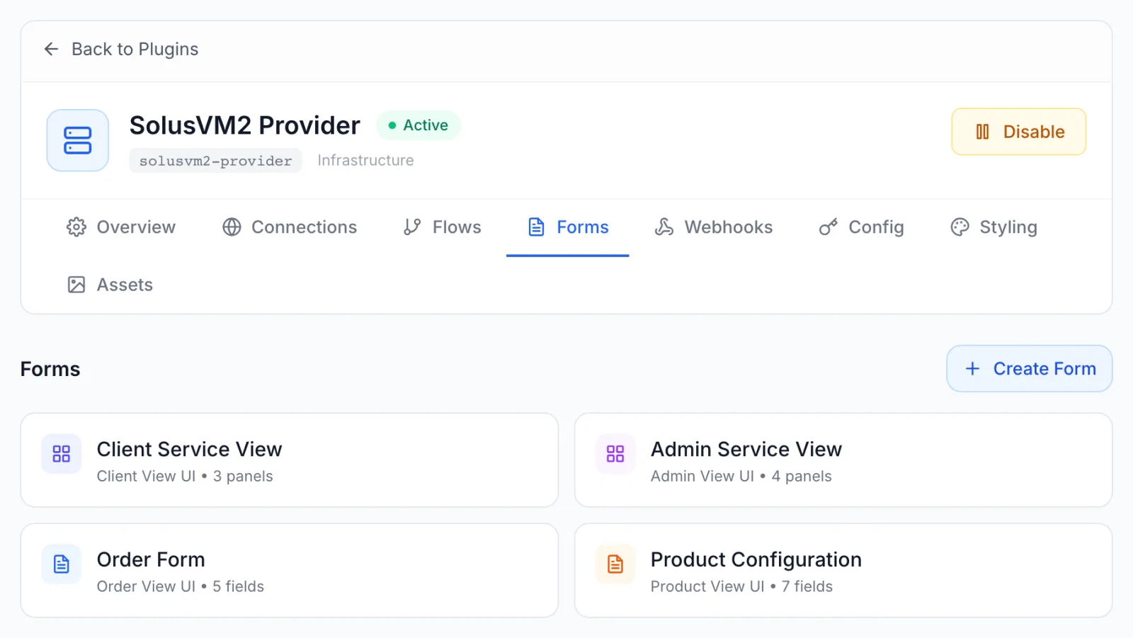
Forms are the screens your plugin adds to the platform. A plugin can draw its own service page for customers, its own controls on the staff service page, its own settings in the product editor and its own fields on the order page. You build each of these on the plugin's Forms tab, with a drag-and-drop builder, and connect them to your plugin's flows. This article explains the four form types, the builder, every panel and field type, and what customers and staff see.
Forms are optional. A plugin without a service-page form gets the platform's standard service page. Forms are part of the plugin developer guide: if you only install ready-made plugins, you do not need to build any.
Where to find it
- Open Settings from the top header and choose Plugins under Integrations. The Plugins screen needs a staff account with admin access.
- Open the plugin you are building.
- Choose the Forms tab.
Notification and Analytics plugins have no Forms tab: they have no service pages or order fields. Every other plugin type shows it, but the four form types below are read for products and services, so in practice forms belong to Infrastructure Provider plugins (including Domain Registrar ones). See Plugins introduction for the plugin types.
The four form types
Every form has a Form Type, chosen when you create it. The type decides where the form appears and which builder you get. The two service views are panel-based: you place ready-made blocks such as an info card or a row of buttons. The other two are field-based: you place input fields.
| Form Type | Builder | Where it appears | Who sees it |
|---|---|---|---|
| Admin View UI | Panels | The service details page in the admin panel, in the Provider Controls card for services this plugin manages | Your staff |
| Client View UI | Panels | The service page in the client panel, for services this plugin manages | Your customers |
| Product View UI | Fields | The Configuration tab of the product editor, for products in a category that provisions through this plugin. The form's name is the section heading. | Your staff |
| Order View UI | Fields | The order page, for products in a category that provisions through this plugin | Your customers |
The platform uses one form of each type per plugin. If a plugin has two forms of the same type, the one created first is used. Keep one form per type and edit it, rather than adding a second.
Create a form
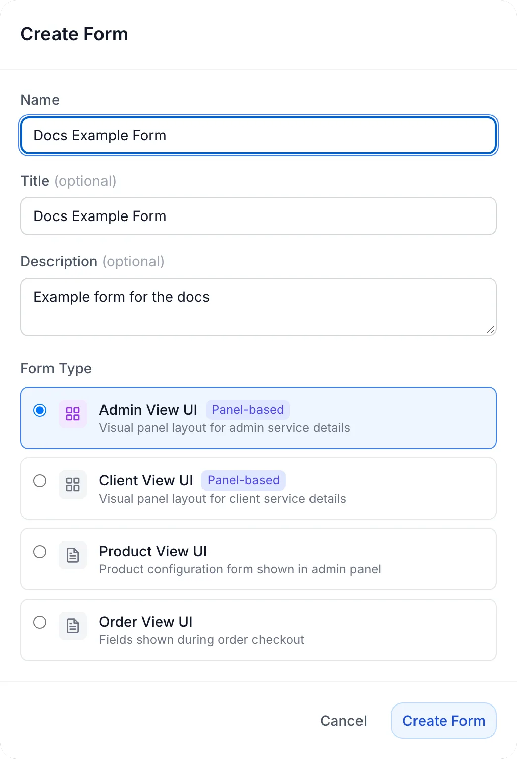
- On the Forms tab, click Create Form. (With no forms yet, the tab says No forms yet and shows the same button.)
- Fill in the dialog:
- Name (required). The name you see on the Forms tab. For a Product View UI form it is also the heading staff see in the product editor. Two forms in one plugin cannot have the same name.
- Title and Description (optional). A heading and a note kept with the form, for your own reference.
- Form Type. One of the four types above. The two service views carry a Panel-based badge.
- Click Create Form. You see Form created and the new card appears.
- Click the card to open the builder.
The form type cannot be changed later. To switch type, create a new form and delete the old one. To delete a form, hover its card, click the bin icon and confirm Delete this form?.
The builder
The builder opens full screen and has three columns.
- Left: the palette. Two tabs: Panels (or Fields for a field-based form) and Blocks, plus a search box. Click an item to add it, or drag it onto the canvas.
- Centre: the canvas. A live preview of the form. Switch the preview width with Desktop, Tablet and Mobile. Click a panel or field to select it. Hover a panel for its tools: Duplicate, Save as reusable block and Delete.
- Right: the sidebar. Two tabs. Config holds the settings of the selected panel or field. Layout arranges the form into sections. With nothing selected, it says Select an element.
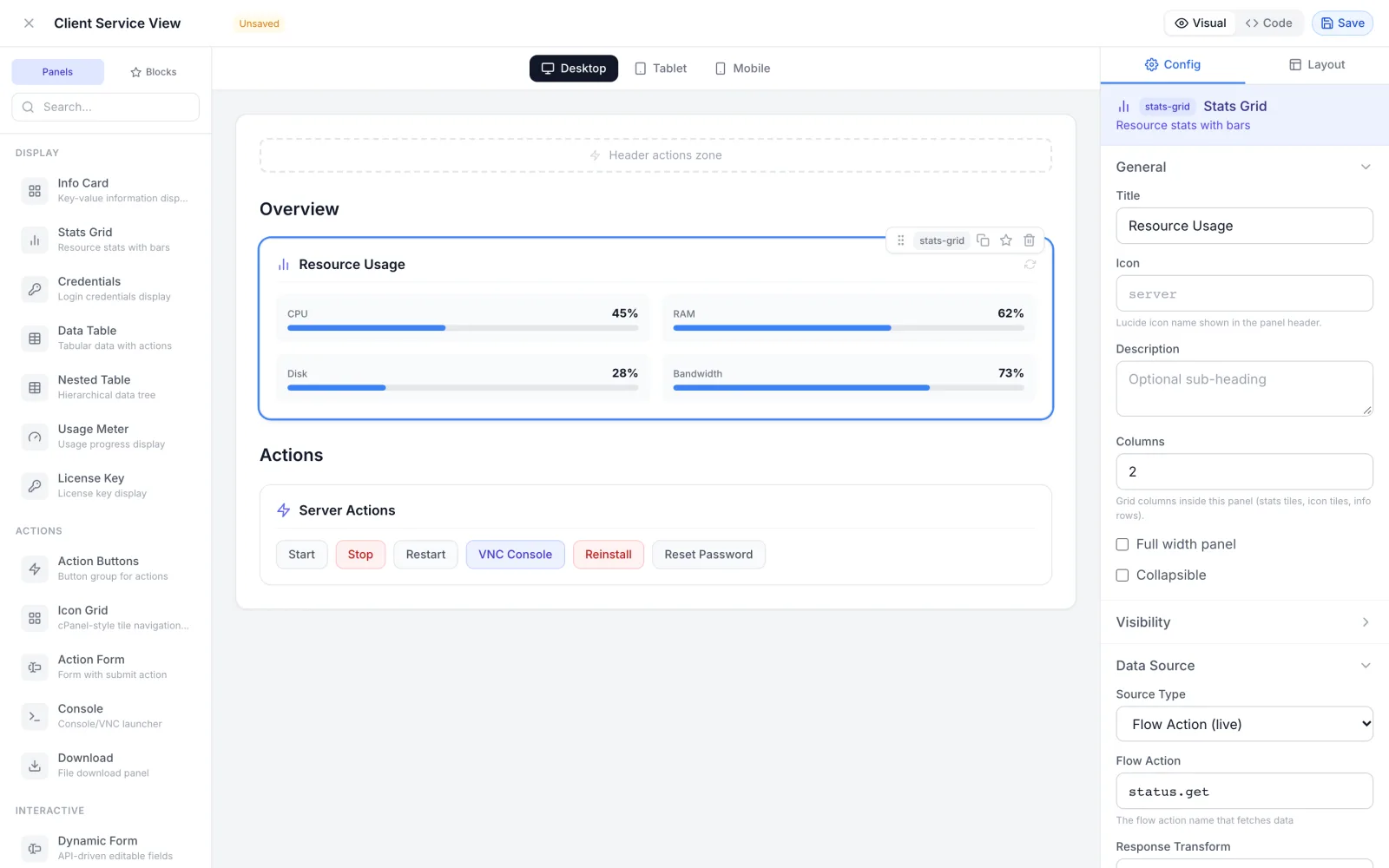
The header holds the form name (click it to rename), an Unsaved badge when you have changes, the Visual / Code switch and Save. Ctrl+S (Cmd+S on a Mac) saves. Esc or the close button leaves the builder; with unsaved changes it asks You have unsaved changes. Discard?. A successful save shows Form saved and returns you to the Forms tab.
Service pages: Client View UI and Admin View UI
A service view is a set of panels. Most panels either show data that a flow returns, or run a flow when the user clicks something. A panel names the flow it uses: the flow's operation or its slug. The flow must be a Custom Action or Data Fetch flow of the same plugin. If no operation or slug matches, the first such flow whose name contains the text is used. See Building flows and Capabilities and flow contracts for what each flow receives and returns.
Besides your own flows, panels can use these built-in actions: status.get, stats.get, console.getUrl, backups.list, backups.create, backups.restore, backups.delete, reinstall, password-reset, and the power actions power.start, power.stop, power.restart, power.reboot, power.shutdown, power.boot, power.reset, power.poweroff and power.kill.
Panel types
The palette groups the panels into four categories. All of them work on the client service page. The admin service page shows a subset, marked in the last column.
| Panel | Category | What it does | Admin View UI |
|---|---|---|---|
| Info Card | Display | Label and value rows from a flow's output, each with a Display Type (Text (default), Status Badge, Date, Date & Time, Bytes (auto-format), Link, Multi-line text) and an optional copy button | Yes |
| Stats Grid | Display | Resource tiles such as CPU, memory and disk, with optional progress bars and auto-refresh | Yes |
| Credentials | Display | Login details, optionally masked, copyable, and with a regenerate button | Yes |
| Data Table | Display | A table of rows from a flow, with buttons on each row | Yes |
| Nested Table | Display | A table whose rows expand into child rows, level by level | No |
| Usage Meter | Display | Usage bars against a maximum, for example bandwidth | No |
| License Key | Display | A licence key with reveal, copy, file download and reissue options | No |
| Action Buttons | Actions | A row of buttons, each running one action | Yes, as buttons in the Provider Controls card |
| Icon Grid | Actions | Large tiles that each run an action, like a hosting control panel's home page | No |
| Action Form | Actions | A small form whose values are sent to one action, with an optional warning banner | No |
| Console | Actions | A button that opens a VNC, SPICE, WebSocket or SSH (Web) console | No |
| Download | Actions | A list of downloadable files, each fetched through an action | No |
| Dynamic Form | Interactive | Fields whose definitions come from a flow, saved through another flow | Yes |
| Form Wizard | Interactive | A multi-step form submitted to one action | No |
| Tabbed Panel | Interactive | Tabs that hold other panels | No |
| Record Editor | Interactive | A table of records with create, update and delete actions, for example DNS records | No |
| List Manager | Interactive | A list the user adds to and removes from, for example nameservers | Yes |
| Key-Value | Interactive | A list of settings, each a switch or value saved through an action | No |
| Custom HTML | Custom | Your own HTML and CSS with service values filled in | No |
On the admin page, panels the admin view does not support are left out, so build the Admin View UI from the supported ones.
Panel settings
Select a panel to edit it in the Config tab. The settings come in groups.
- General: Title (the panel heading), Icon (a Lucide icon name shown in the panel header), Description (an optional sub-heading), Columns (grid columns inside the panel; Inherit from section leaves it to the section) and Full width panel (span the whole row of a multi-column section).
- Data Source, for panels that show data: set Source Type to Flow Action (live) and enter the Flow Action, for example
status.getor the operation of your Data Fetch flow. Refresh Interval (ms) with Auto-refresh on the interval reloads a Stats Grid on a timer; the client panel never refreshes faster than every 5 seconds. - Data Key: for tables and lists, the path to the array in the flow's output, for example
backups. Empty Message is shown when that array is empty. - Panel Configuration: the settings of the panel type, such as the rows of an Info Card, the stats of a Stats Grid or the buttons of an Action Buttons panel. Each row has a Label and a Data Key (the key in the flow's output) or an action name.
- Advanced (JSON): the panel as JSON. Edit it and click Apply JSON. It must be a JSON object, or you see Panel config must be a JSON object.
In an Info Card or Credentials row, Source Path reads the value from the service itself instead of the flow, for example service.product_name.
Buttons and confirmations
Each button in an Action Buttons panel has a Label, an Action (flow name), an Icon and a Variant: Primary (Blue), Secondary (Gray), Success (Green), Warning (Orange) or Danger (Red).
- Require confirmation asks the user first, with your Dialog Title and Message.
- Open returned URL in a new tab opens the
urlyour flow returns, for example a single sign-on link to the provider's own panel. - Only show for certain statuses shows the button only while the service's live status, as your status flow reports it, is one of the Statuses you list (comma-separated). The match is on the whole value and ignores letter case:
stoppedmatchesStopped, andsuspendeddoes not matchunsuspended. The client panel hides a button that does not match; the admin panel shows it disabled.
When the flow behind a button fails, the user sees an error message; a flow that ends with an error passes its own message on.
What customers can run
A customer can run only the actions your Client View UI form uses, plus the built-in actions listed above. A flow that no client panel names cannot be started from the client panel, even by a customer who knows its name. This lets you keep staff-only flows, such as listing every account on a server, in the same plugin. Staff-only buttons belong in the Admin View UI.
On a suspended, terminated or cancelled service, customers can still read data but cannot run actions that change the service. The client panel also hides the plugin panels while the service is suspended.
Arrange the page: Layout
The Layout tab of a service view arranges panels into Sections. Click Add to create one, then set its Title, Icon, Columns (1 to 4) and Subsection layout (Stacked (vertical) or Grid (side by side)). A section can hold sub-sections. Drag sections to reorder them.
Panels that are in no section are listed under Unassigned Panels; use Add to... to place each one. On the canvas, drop a panel on a section to place it there. To put buttons in the header of the client service page, beside the service name and in place of the standard power buttons, drop an Action Buttons panel on the Header actions zone; the header shows only buttons, so use that zone for Action Buttons panels only.
The client service page opens on the first section, with its sub-sections. Put everything a customer needs on one page into the first section and organise it with sub-sections. Further top-level sections open from an Icon Grid tile that points at them; you set that link on the tile in Code view (targetSection with the section's id), and the page then shows a breadcrumb back. A form with no sections shows all its panels one after another.
The admin page does not use sections: it shows the supported panels in order, after the Provider Controls card.
Custom HTML panels
A Custom HTML panel takes your HTML and CSS. Write {{service.hostname}}, {{service.ip}}, {{service.status}}, {{service.username}}, {{service.os}}, {{service.location}} or {{service.product_name}} to insert service values, and list them under Template Variables. The panel is drawn in an isolated frame between 100 and 600 pixels high. Scripts, frames, forms, inputs and buttons are removed, and so are @import and url() in the CSS. Use it for static information; use the other panel types for anything interactive.
Order and product forms: Order View UI and Product View UI
A field-based form is a list of input fields. On the order page, the customer's answers are passed to your provision flow with the order. In the product editor, the values are saved on the product and passed to your flows as the product's plugin settings. See Capabilities and flow contracts for the provision input.
Field types
The Fields palette has six groups: Basic Inputs (Text Input, Number, Password, Text Area), Selection (Dropdown, Checkbox, Toggle, Radio Group, Multi Select), API-Driven (API Select, API Multi), Advanced (JSON Editor, Slider, Tags), Infrastructure (Location, OS Image, Plan) and Display (Read Only, Hidden, Info Box, Divider). Each page draws its own set of controls. Use the types in this table for each form; a type a page does not list is shown as a plain text box there.
| Form | Field types to use |
|---|---|
| Order View UI | Text Input, Number, Password, Dropdown, Checkbox, Toggle, Slider, Location, OS Image, Plan |
| Product View UI | Text Input, Number, Text Area, Dropdown, Toggle, API Select, API Multi, JSON Editor, Tags |
On the order page, Plan lists the products of the category, and Location and OS Image list what the chosen product offers. The order page also adds the product's configurable options after your fields, so you do not need a field for them.
Field settings
Select a field to edit it in the Config tab (Field Configuration).
- Basic Settings: Field Key (the name your flow reads the value under), Label, Placeholder, Description and Required. A new field gets a generated key; replace it with a short name such as
hostnamebefore your flows depend on it. - Options, for Dropdown, Radio Group and Multi Select: a Value and Label for each choice; Add Option adds one.
- Number Settings, for Number and Slider: Min, Max, Step.
- API Flow Settings, for API Select and API Multi: Fetch Flow (the slug of the flow that returns the choices), Option Key (the key in the flow's output that holds the array), Value Field and Label Field (the keys of each choice). The product editor runs the flow when it opens.
- Dependencies: Depends On lists other fields (comma-separated). The choices load once all of them have a value and reset when one changes. Request Param Name is the name the dependency's value is sent to the fetch flow under.
- Default Value.
- Validation: Min Length, Max Length, Pattern (Regex) and a Custom Error Message. The order page checks these when the customer submits. Check the values again in your flow: the order page check runs in the customer's browser.
- Conditional Display: tick Enable Conditional Display to show a field only when another field matches. On the order page, use Equals or Contains.
Keep keys stable. In Code view, give each field the same value for
id,keyandname, for example"id": "hostname", "key": "hostname", "name": "hostname". Then the order page, the product editor and your flows all use the same name for the value.
Field layout
The Layout tab of a field-based form sets the Layout Type: Simple List, Sections, Accordion (Allow multiple open), Tabs (Tab position Top or Left), Wizard (Show progress, Allow skip, and Validate before next step per step), Grid or Columns (with Columns). Every layout except Simple List groups fields into sections or steps; fields in none are listed under Unassigned Fields.
The order page draws all seven layouts. The product editor draws Simple List, Sections, Grid and Columns, and shows any other layout as a simple list.
Reusable blocks
To reuse a panel you have configured, hover it on the canvas, click Save as reusable block and give it a name (Block name:). You see Block "<name>" saved. Saved blocks appear on the Blocks tab of the palette for the forms of this plugin; click one to insert a copy (Block "<name>" inserted). Until you save one, the tab says No saved blocks yet.
Code view
Click Code in the header to see and edit the whole form as JSON. For a service view the JSON holds the panels and the layout; for a field-based form it holds the field list and the layout. Code view is the place for settings the visual editor does not offer, such as a tile's targetSection or a Tabs layout for a service page. Save checks the JSON first; if it is not valid you see Invalid JSON: followed by the parser's message, and nothing is saved.
Forms travel with the plugin when you export it, and arrive with it when you import a package. See Packaging, importing and updating.
What customers and staff see
- Customers open the service in the client panel. With a Client View UI form, the page shows your panels in place of the standard server information card. Without one, they get the standard service page.
- Staff open the service in the admin panel. The Provider Controls card names the plugin and holds your Action Buttons under Server Controls (or under the panel's title when the form has one Action Buttons panel). Your other supported panels follow below it.
- Staff editing a product see the Product View UI fields on the product editor's Configuration tab, under the form's name.
- Customers ordering see the Order View UI fields on the order page, before checkout.
Troubleshooting
| You see | Cause and fix |
|---|---|
| This action is not available from the client panel (customer) | The action is not used by the plugin's Client View UI form and is not a built-in action. Add the button or panel that uses it to the Client View UI form, or move the button to the Admin View UI. |
| This service is suspended — pay the outstanding invoice to manage it again (customer) | The service is suspended. Customers can read data but not change the service until it is active again. |
| Unknown action (customer) | A power. action uses a word that is not one of the power actions listed above. Use a listed one, or name your own flow without the power. prefix. |
| Unknown panel type: on the service page | The form's JSON uses a panel type the client panel does not know. Correct the type in Code view. |
| A panel is missing from the client service page | It is not in the first section. Move it there in the Layout tab, or open its section from an Icon Grid tile. |
| A panel is missing from the admin service page | Its type is not one the admin page shows. See the Admin View UI column of the panel table. |
| A button never appears | Check Only show for certain statuses: the live status must equal one of the listed values. |
| Panel config must be a JSON object | The text in Advanced (JSON) is not a JSON object. Correct it and click Apply JSON again. |
| Invalid JSON: … | The JSON in Code view has a syntax error at the place the message names. Fix it and save again. |
| Failed to create form or Request failed when creating a form | Most often another form in the plugin already has that name. Choose a different name. |
| Your changes do not show | The plugin has a second form of the same type created earlier, and that one is used. Delete the extra form or edit the first one. |
Related articles
- Building flows: the flows your panels and fields call.
- Configuration settings: the plugin's own settings form, which is separate from these forms.
- Capabilities and flow contracts: what the platform sends to provision and action flows.
- Plugin styling and assets: the Styling and Assets tabs.